

Farrow & Ball is is a British manufacturer of paint and wallpaper. They’re a particular favorite of interior designers and DIYers everywhere for their unique shades and color names. I particularly love F&B paint colors because they have so many “mood ring colors”—colors that shift and morph throughout the day in different lighting. This only happens when a paint shade is very complex with multiple undertones. F&B has this nailed.
Below, you’ll find my top 5 Farrow & Ball paint colors, including the ones I’ve used in my home…


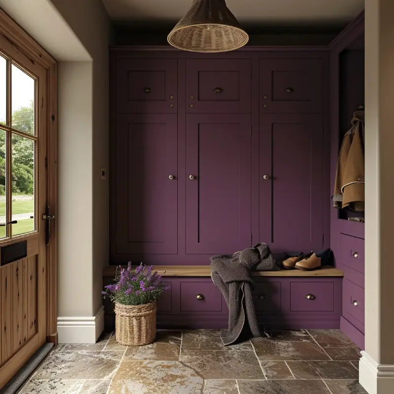
Farrow & Ball Brinjal
Farrow & Ball Brinjal is the most beautiful shade of eggplant/aubergine. In fact, “brinjal” is the South Asian word for the fruit. (Yes, it’s technically a fruit. Feels weird, I know!) Unlike other eggplant paint colors that lean more cool-toned purple, Brinjal is much warmer and leans almost toward a deep red wine color. Because it straddles purple and red, this paint color will morph in different lighting. In warm west-facing light, it will appear more burgundy. In cool east-facing light, more purple. I haven’t used this color in my home yet, but you can be sure I will!


Farrow & Ball Light Blue
Farrow & Ball Light Blue is one of my favorite paint colors I’ve ever used. It feels like you’re out on the sea on a foggy morning. It is definitely a light blue but also has a lot of gray and green in it, so again, it shifts throughout the day. In shade, it appears more blue. In direct sun, more aqua. If I were ever painting a beach house, this is the color I’d use. So far, I’ve only used it on my study ceiling, but I loved it so much I have plans to use it as an all-over treatment in another room.


Farrow & Ball Treron
Farrow & Ball Treron is an absolute delight. It’s a warm green-gray that’s incredibly soothing to look at and is warm enough that it doesn’t lean blue no matter the lighting. In direct light, it will appear more green. In the shade, the gray comes through more. I used it on my dining room ceiling, and it’s probably one of the best design choices I’ve ever made. It can be hard for me to paint a room all white, so having a color pop on the ceiling that wasn’t too garish or bright was a must for me. I just love this green.


Farrow & Ball Pointing
Farrow & Ball Pointing is a rich, creamy off-white. In my opinion, it has the perfect peach undertone, so it’s not too yellow or too pink and coordinates with many other colors. I used this color as an all-over treatment in my guest bedroom after adding picture frame moulding, and it gives the perfect Parisian apartment feel. It also would look beautiful and soft next to darker colors, like Treron, where a bright white may look too harsh.


Farrow & Ball Pigeon
Farrow & Ball Pigeon is an interior designer favorite for a reason. You can’t pin down this color easily, just like you can’t describe the coloring of a pigeon. Is it gray, green, or blue? Well, it depends. This color morphs so much. In a shiny paint finish, it would work well for a light and bright room. In a more matte finish, it leans toward a medium tone that’s soothing and soft. I used it in matte in my upstairs hallway, which gets very little natural light, and it’s just dark enough to make me happy (I love a rich cozy paint color) without making the space feel cave-like.
For some of my favorite Benjamin Moore paint colors, check out My Top 5 Green Exterior Paint Colors and My Top 5 Dark Green Interior Paint Colors.
